Graphic Designer / Photographer
Zurich, Switzerland
+41 78 953 73 90
Instagram @nicolaijaronkager
2023 – Internship at Studio Achermann
2022 – Exchange at PolyU [ Hong Kong ]
2020 – 2024 – VC ZHdK [ Bachelor ]
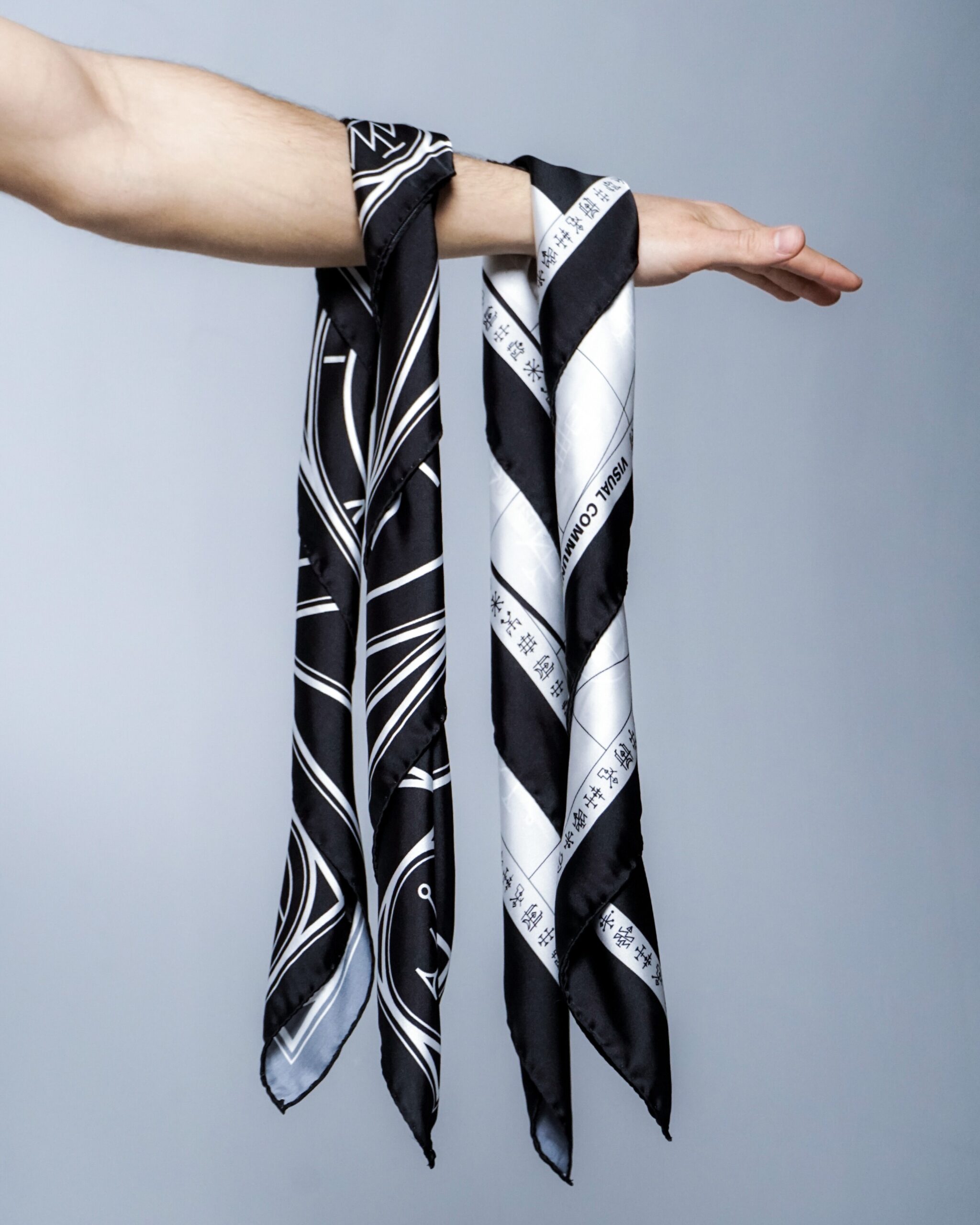
Für die verschiedenen Schwerpunkte, welche zum Studium der Visuellen Kommunikation gehören, haben die Studierenden des dritten Semesters Symbole entworfen.
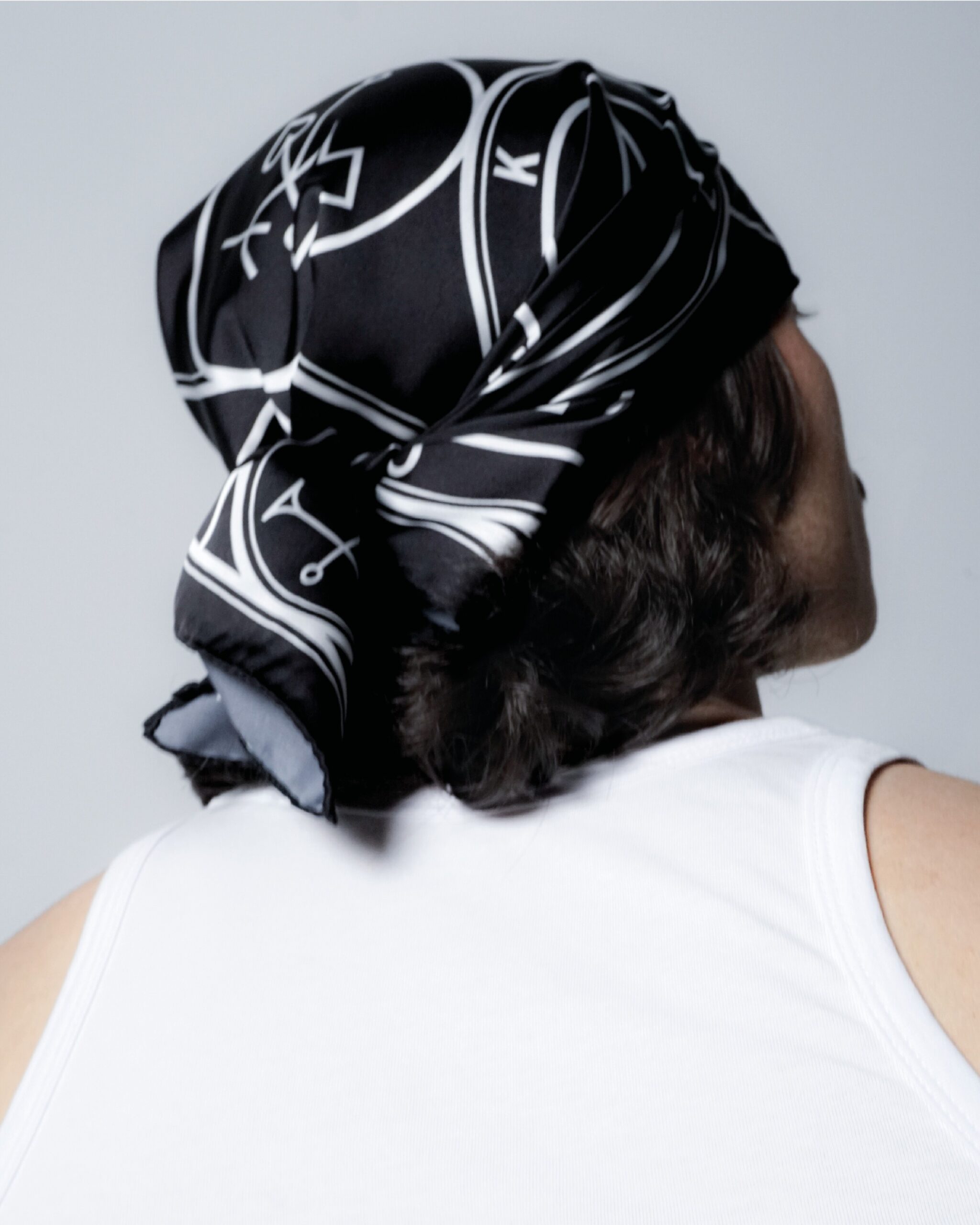
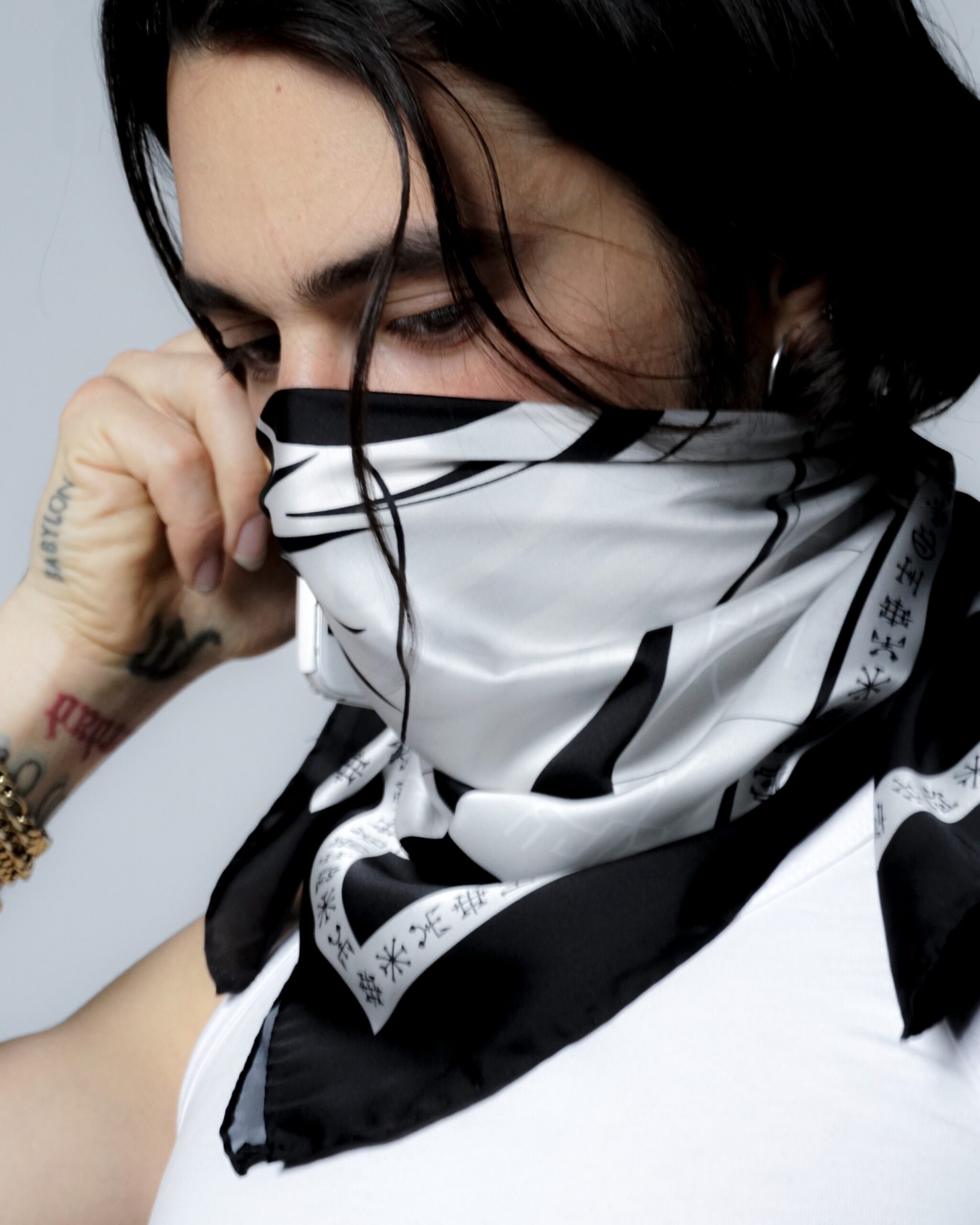
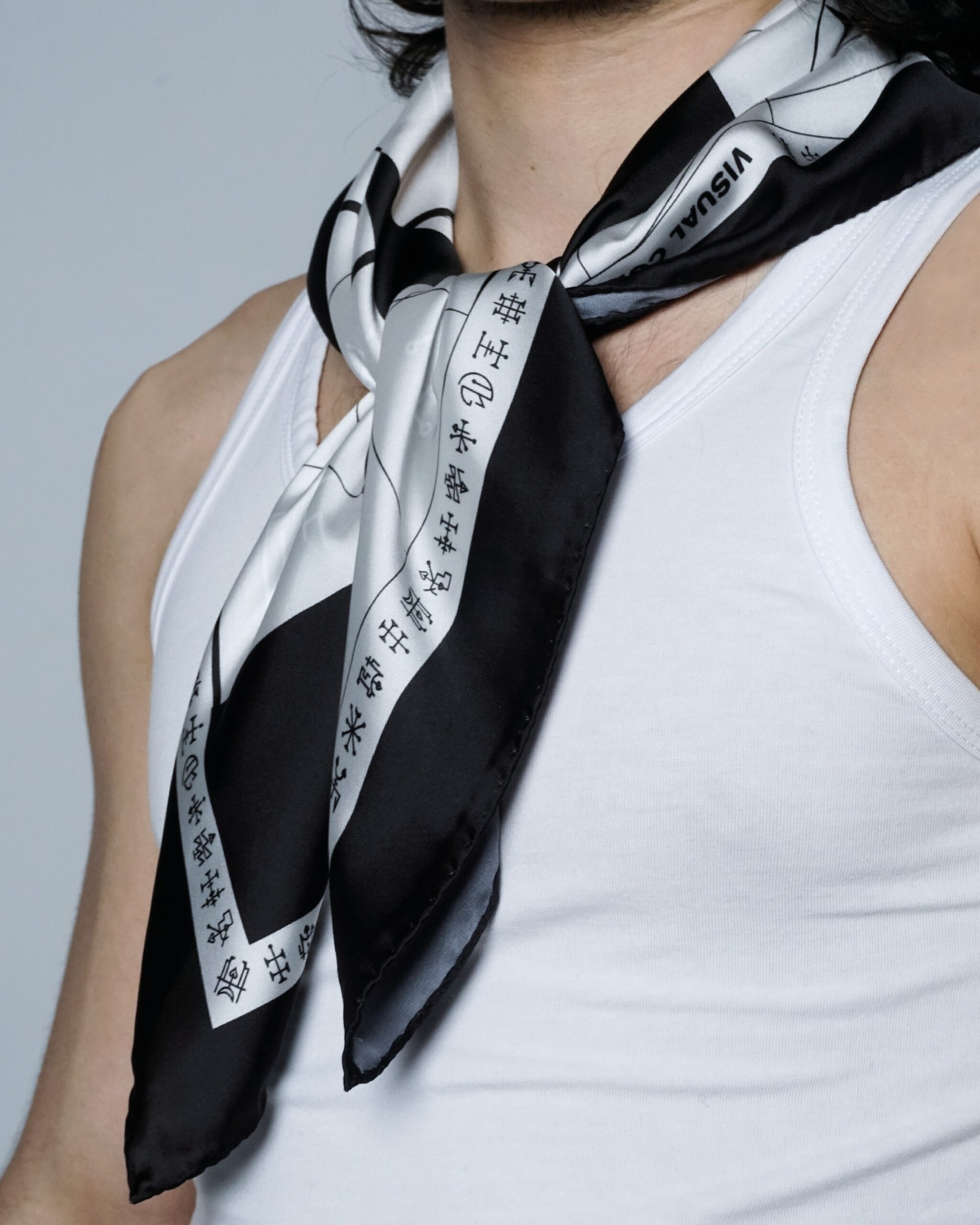
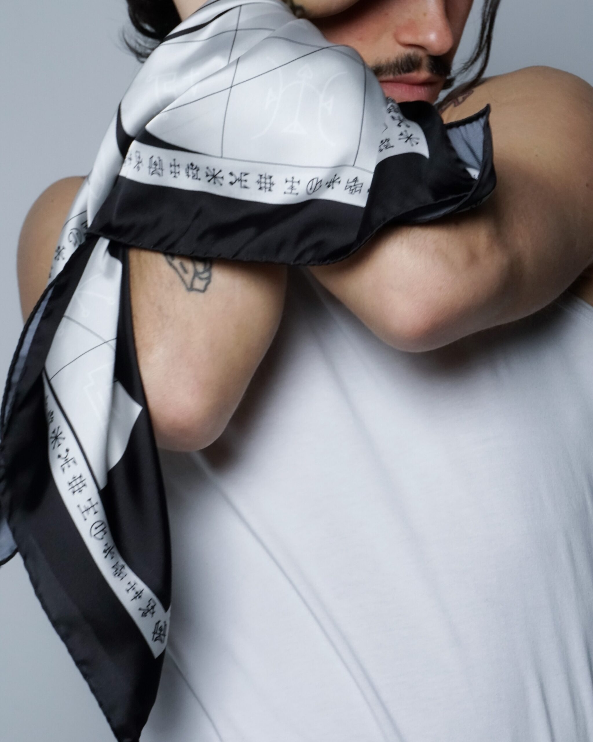
In Bezugnahme auf die Schwerpunkte des Bachelor Studiums der Visuellen Kommunikation, haben Studierende des dritten Semesters Symbole entworfen, welche das dreijährige Curriculum der Bachelor Vertiefung Visual Communication an der ZHdK illustrieren. Ursprünglich sind die Studierenden von der Ästhetik der Siegel ausgegangen. Diese werden oft im Zusammenhang mit Glauben, Mythen, Magie aber auch Sekten verwendet. Sie sind grafische Symbole, die meist aus typografischen Ligaturen bestehen. Der kultische Bezug ist mit Humor zu verstehen und setzt sich mit Themen wie Identifikation und dem Elitarismus auseinander.
Das Projekt Cult of Dark Visual Arts kombiniert eine Vielfalt verschiedener Grafikdisziplinen wie dem Zeichnen und Konzipieren von Piktogrammen, dem Aufsetzen einer passenden Identität sowie der Inszenierung eines Produktes durch Fotografie und Film.
Join the Cult
Entstanden sind zwei verschiedene Motive, welche auf 70 × 70 cm grosse Seiden/Polyester Foulards gedruckt wurden.
Das Foulard des Cult of Dark Visual Arts kann ab jetzt für CHF 20.– direkt unter info.vvk@zhdk.ch bestellt werden.
Photography: Nicolai Jaron Kager
Videography: Nicolai Jaron Kager
Video Credits: Severin Weber
Sounddesign: Nicolai Jaron Kager
Model: Akira Gruber
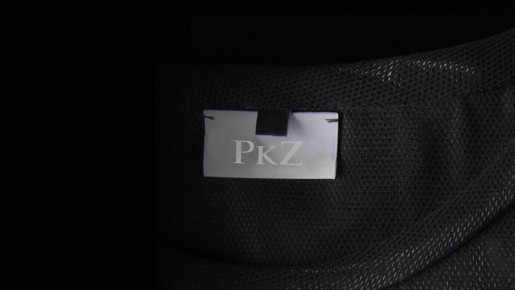
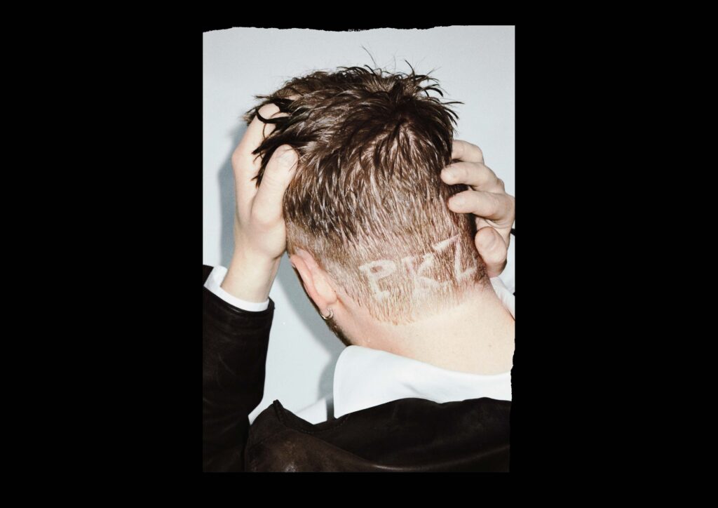
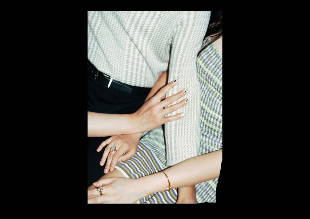
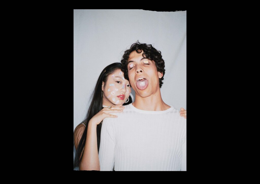
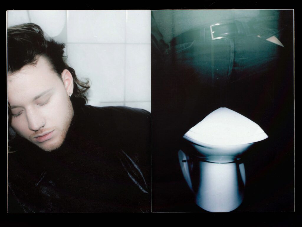
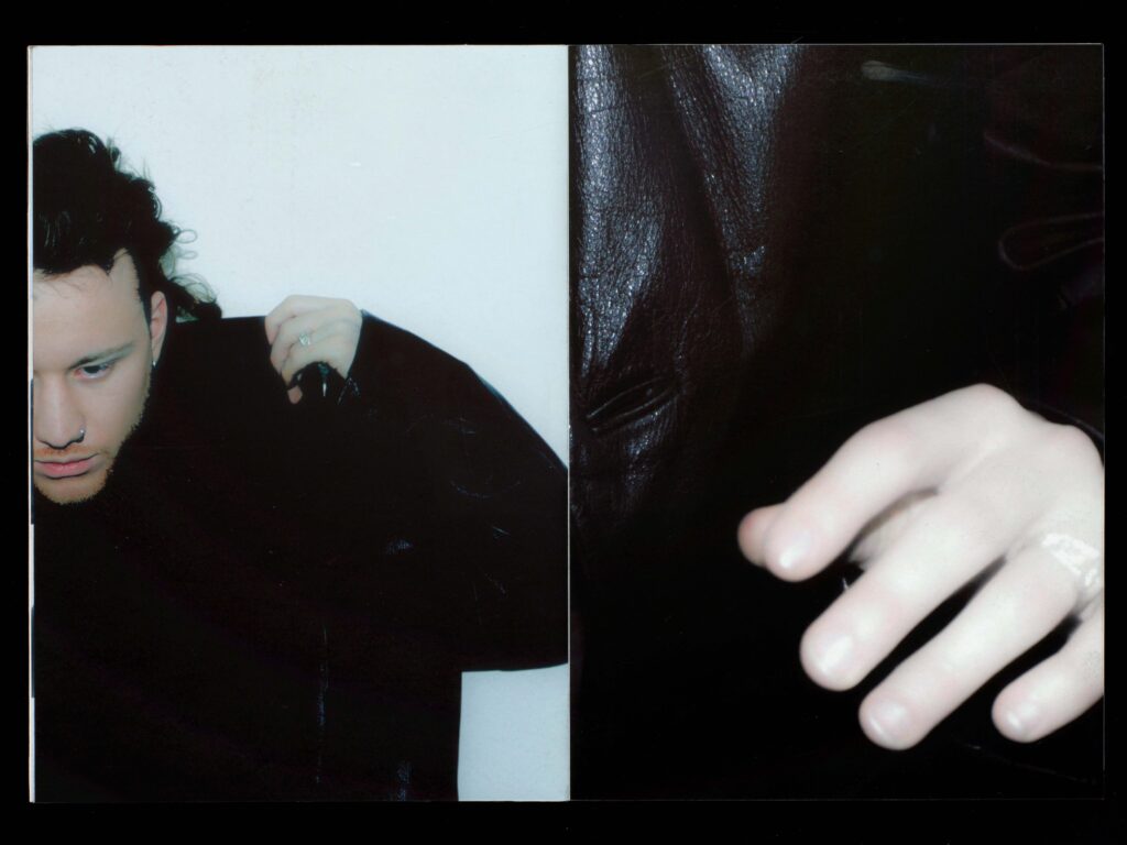
On the occasion of its 140th anniversary, PKZ is cooperating with the Zurich University of the Arts. The winning campaigns will be implemented by PKZ this fall and in spring 2022. The collaboration builds a bridge from the past to the future: For the PKZ x ZHdK collaboration it was crucial for us to appear young, wild and authentic. We were looking for the unconventional. The typography, i.e. the logo, is not overlaid digitally over the photo. Instead, the letters “P K Z” become an integral part of the photograph. Image and type become one. This makes the use of typeface seem more deliberate, more specific and more creative. It leads to a stronger identification with the PKZ brand and makes reference to the story line. Passion and self-confidence are important keywords here. In the three-part poster series, the logo appears in the form of stickers, gel nails and a shaved hair pattern. Each of these images tells the story of a past party night. The images look as if they were spontaneously created out of the situation, appearing natural and energetic. Automatically the viewer connects the pictures with his / her own experiences. their own experiences. Thus, between the viewer and the images an emotional connection can and the images can develop an emotional connection. Analog photography enhances the effect of spontaneity, capturing a specific moment. Through the torn edges, the images could also be long-lost snapshots, which after a long stowage once again see the light of day, an invigorating memory to which one is made attentive with pleasure again and again. Our goal was to portray an untamed, creative and self-determined generation. The representation is somewhere between elegance and punk. Opposites that attract each other and create an exciting mix, thus representing a diverse generation.
Photography: Nicolai Jaron Kager / Céline Hess
Model: Dylan Derradj / Dami J.
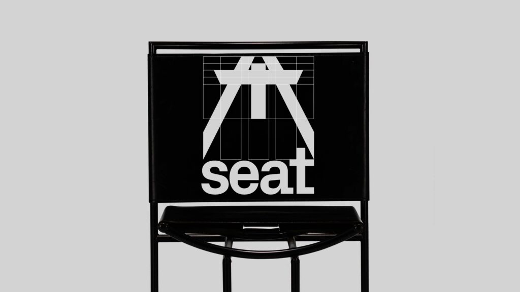
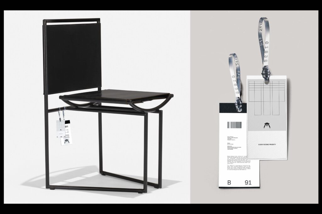
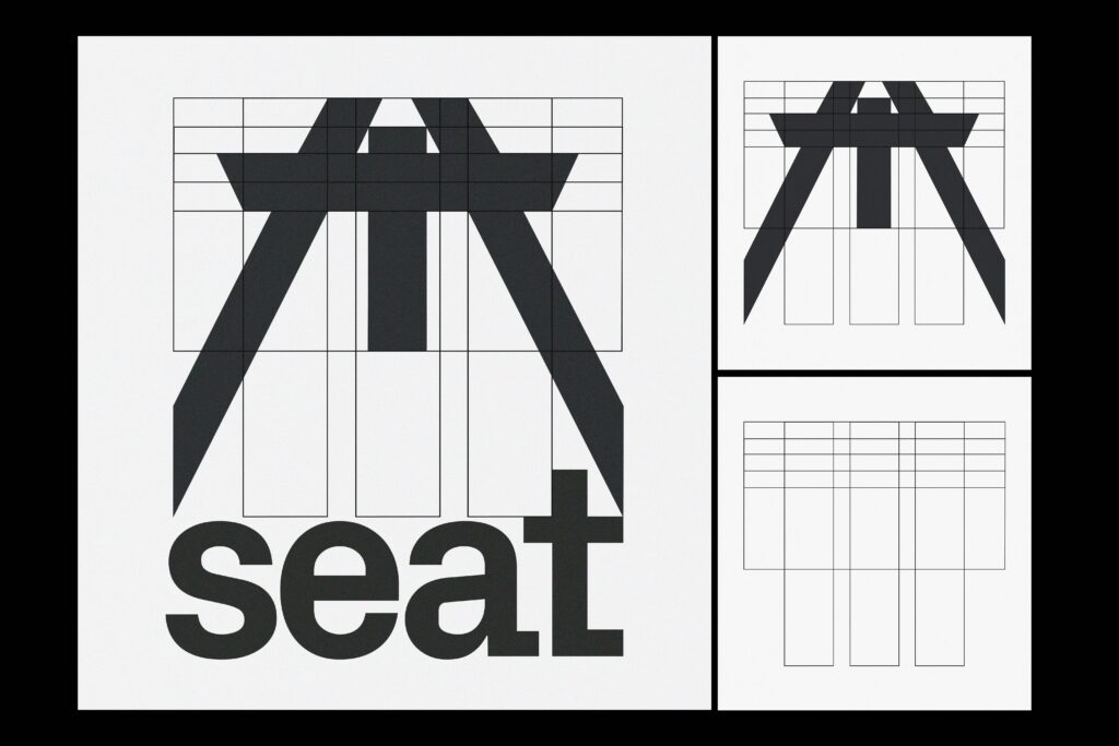
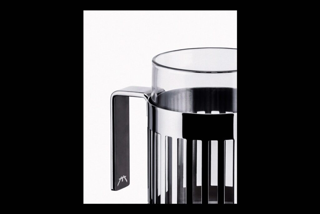
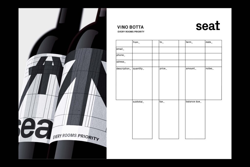
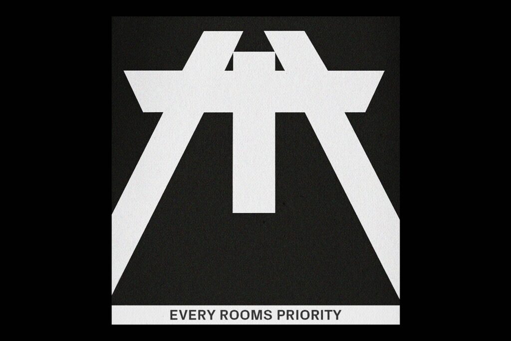
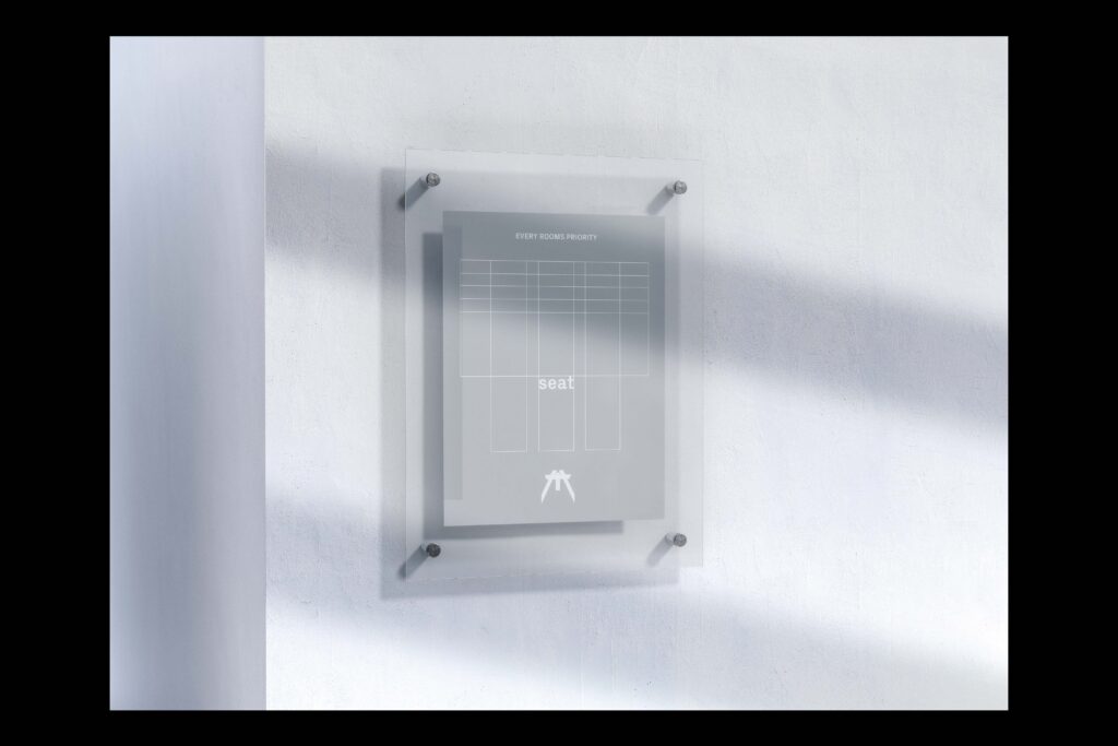
We had to choose a chair from a design collection. The following task was to create a branding for a fictitious furniture company. I chose the chair “Botta 91” by Swiss architect Mario Botta. The uncompromising appearance and cold elegance of the furniture fascinated me. Inspired by the “Botta 91”, I created the motto: “Every Rooms priority”, which became the guiding motif of the whole project. The grid of the logo is reminiscent of a building plan and refers to the architectural background of its creator. In the midst of honest construction and sensitive design the company Seat finds its place.
Furniture: Mario Botta ( Botta 91 )
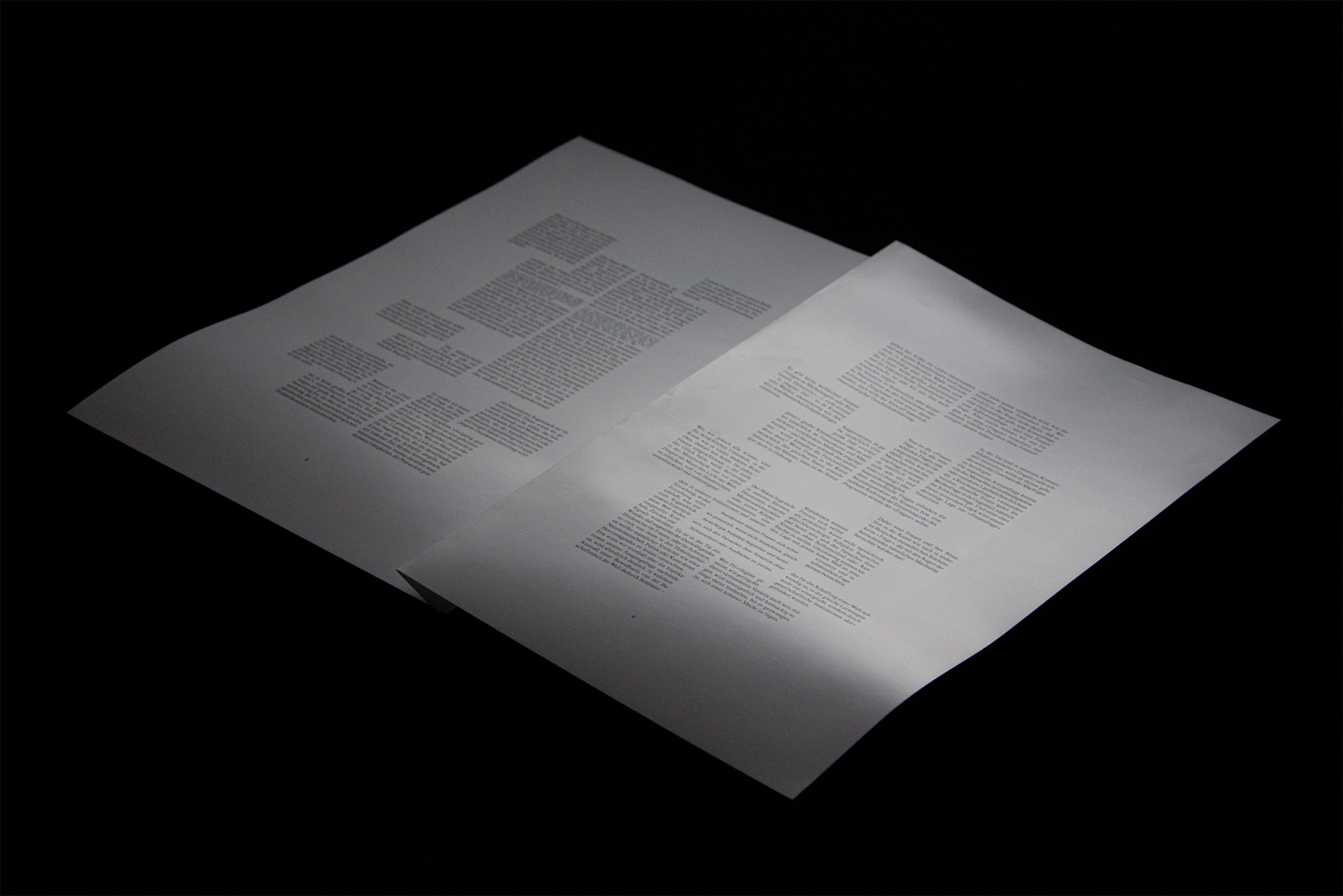
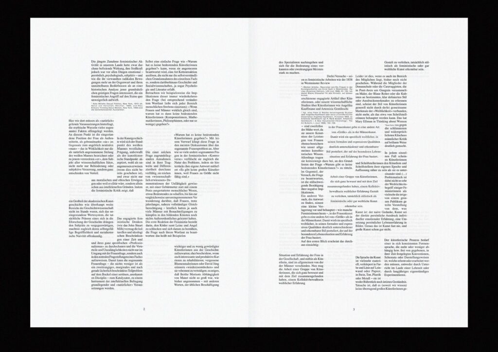
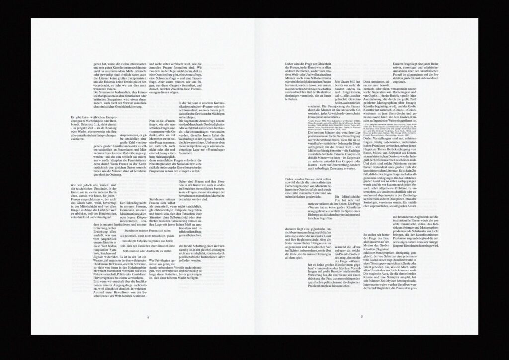
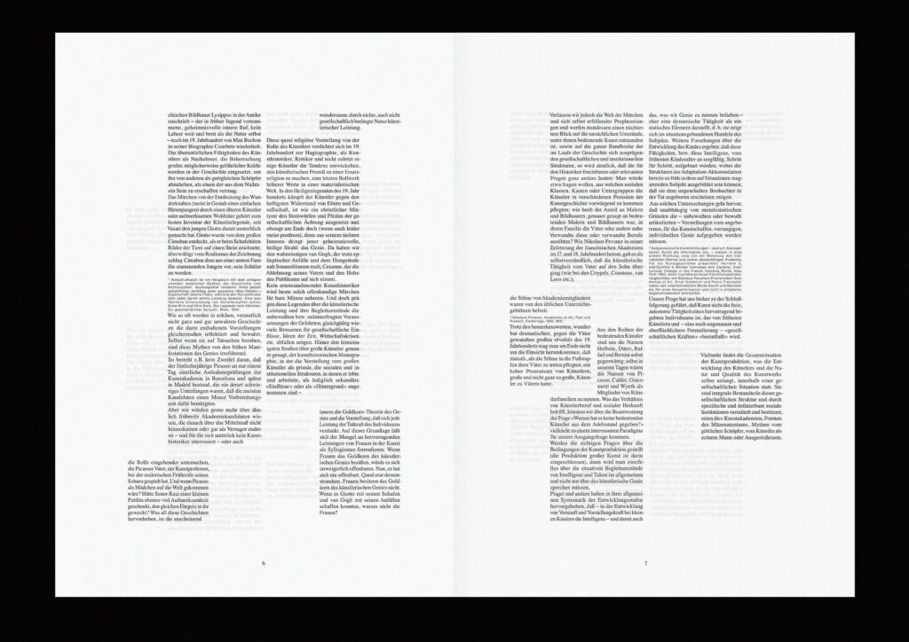
n staging Linda Nochlin’s text “Wieso hat es keine bedeutenden Künstlerinnen gegeben?” I wanted to address the exclusion of women from the art scene through creative compositioning of the text. The whole construct is made up of three columns. The middle column represents the hierarchical, patriarchal and previously represented politics of art. The blocks of text pushed outward symbolize the exclusion of women in art, and the text-“windows” in the middle of two columns represents the isolation of women in art and the phenomena resulting from it. The moral of the concept is that a wall from which fragments are extracted loses stability and sooner or later is doomed to collapse.
Text: Linda Nochlin
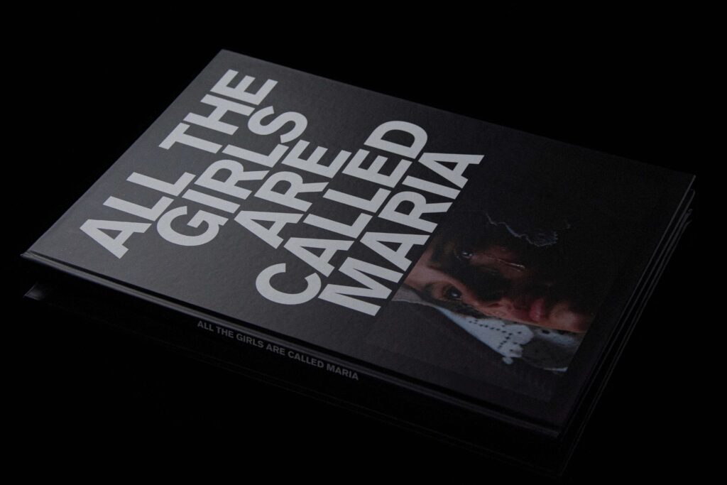
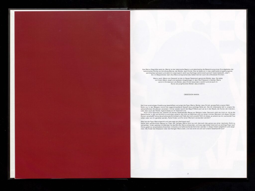
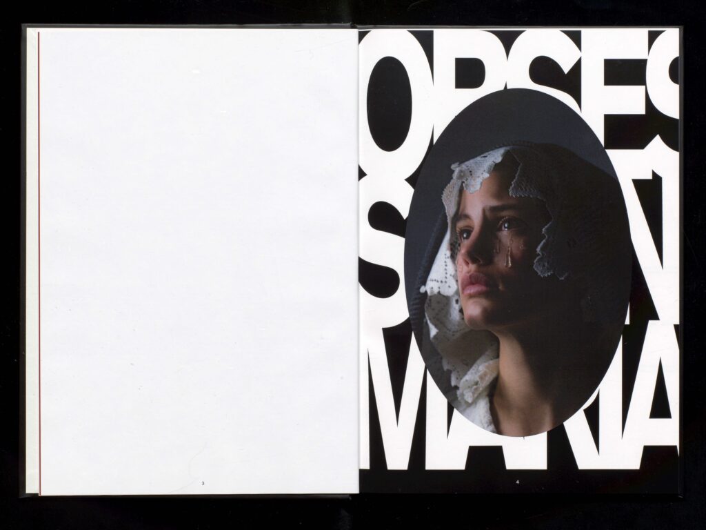
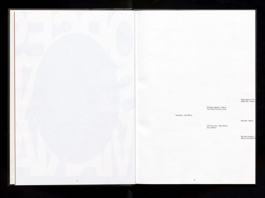
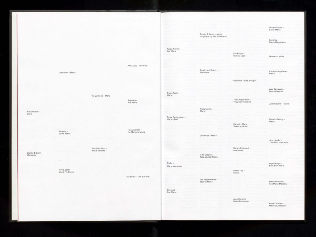
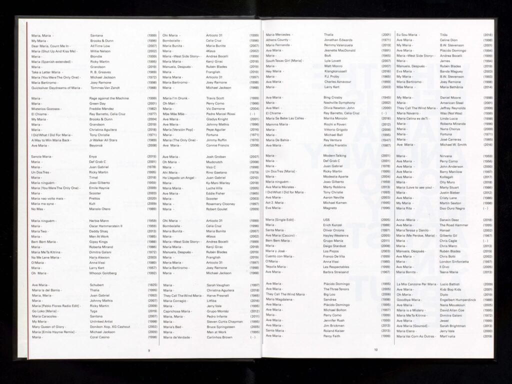
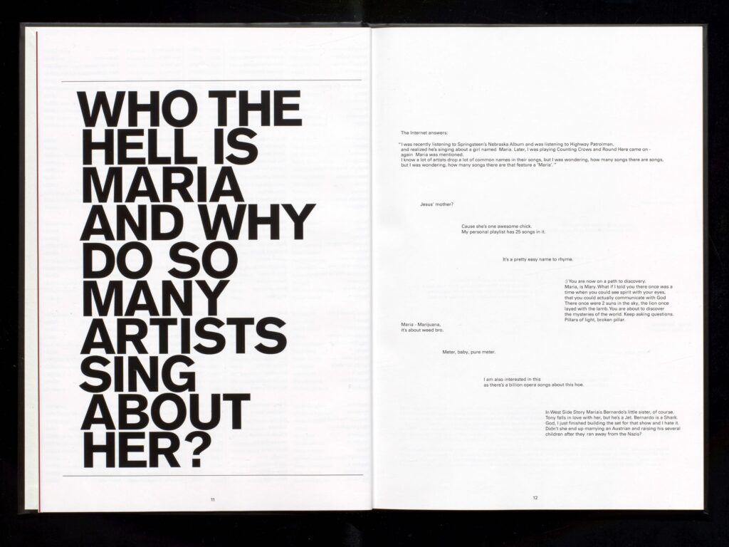
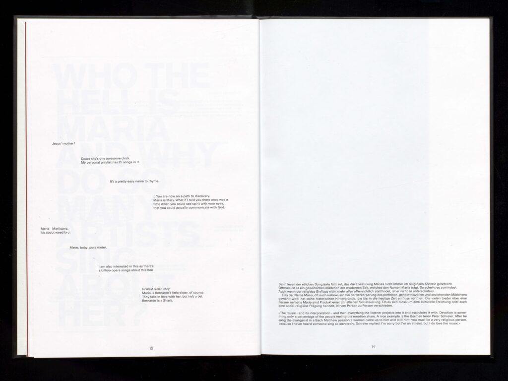
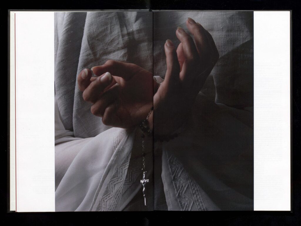
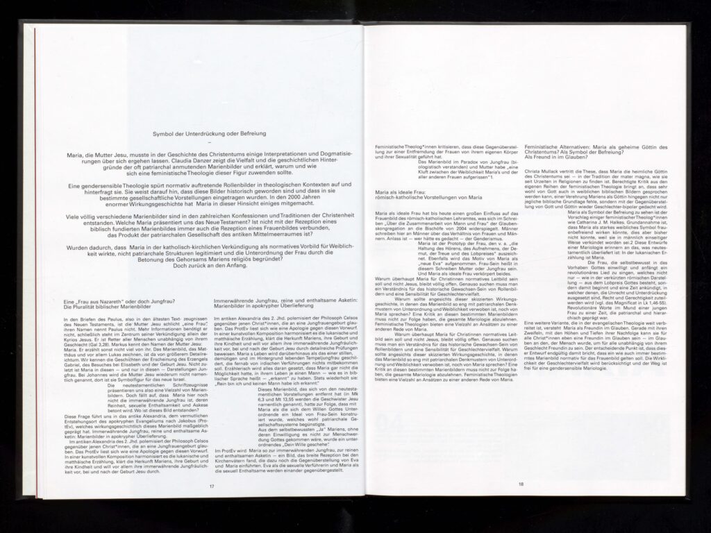
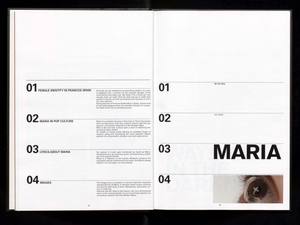
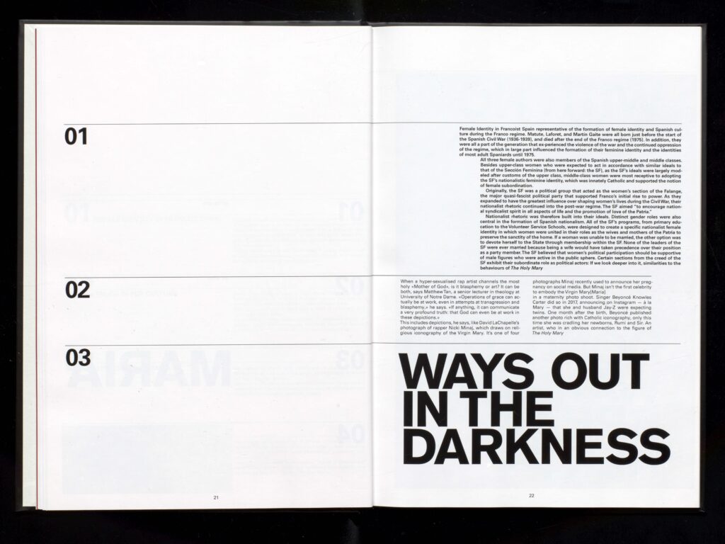
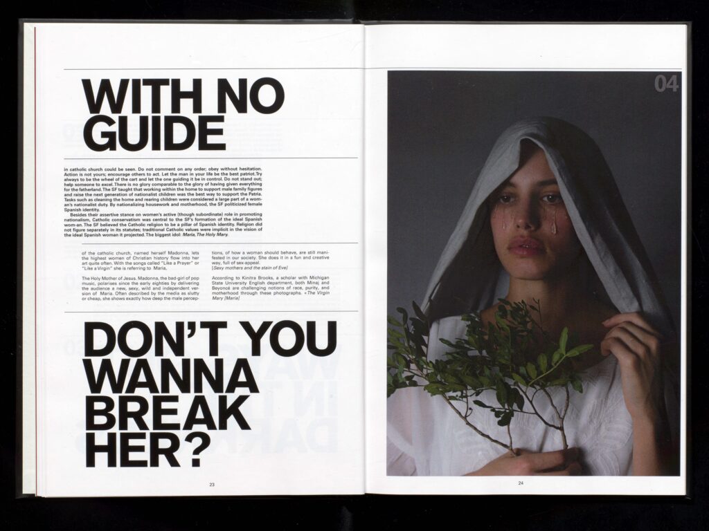
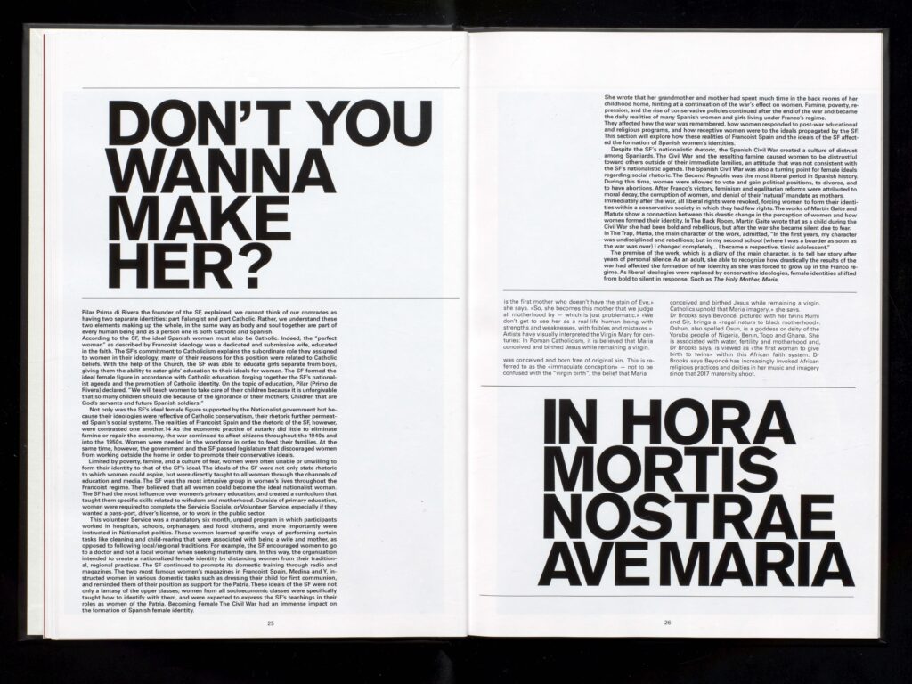
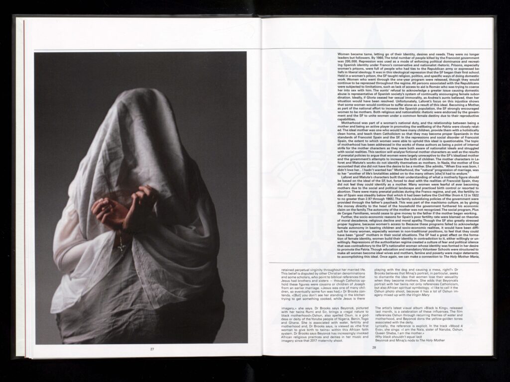
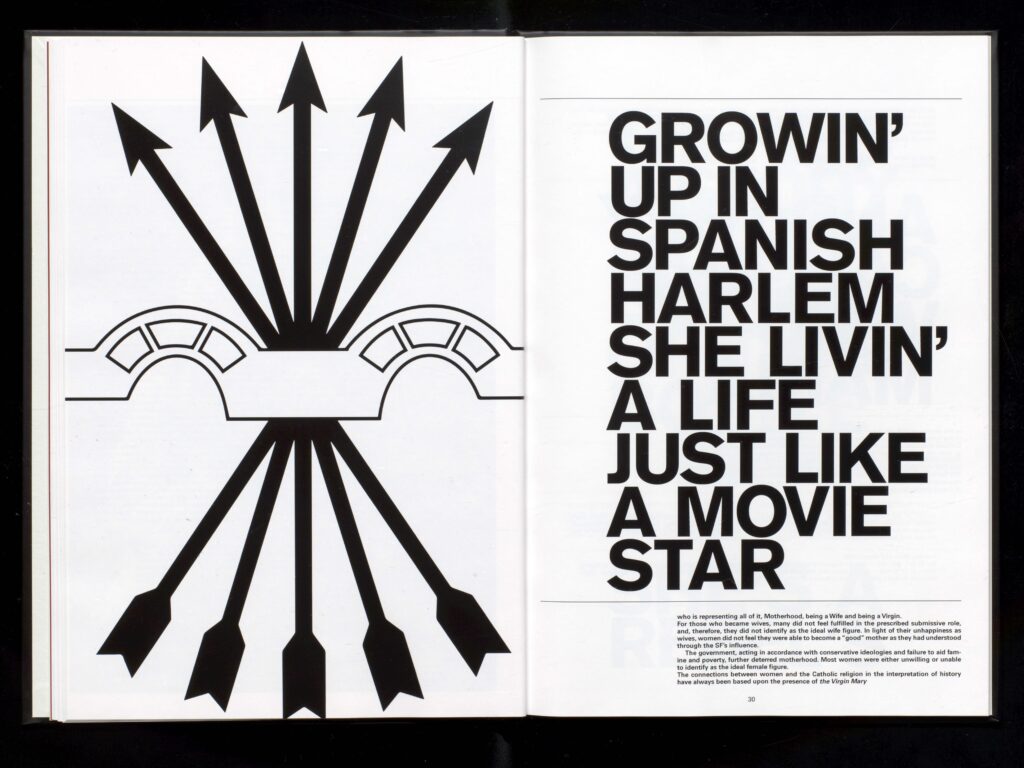
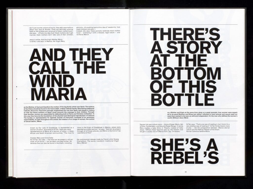
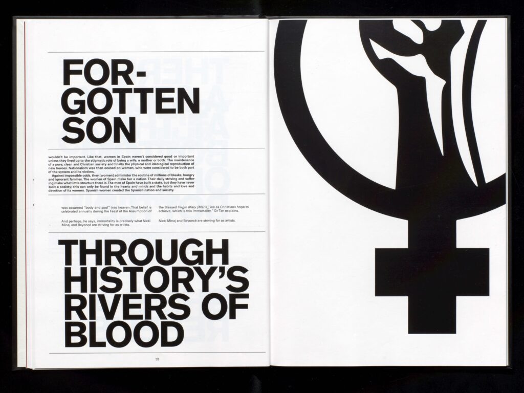
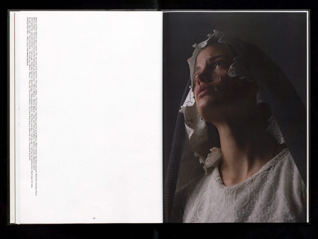
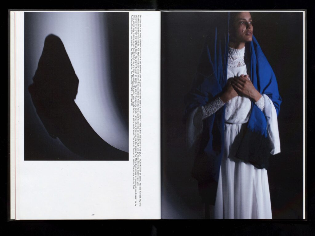
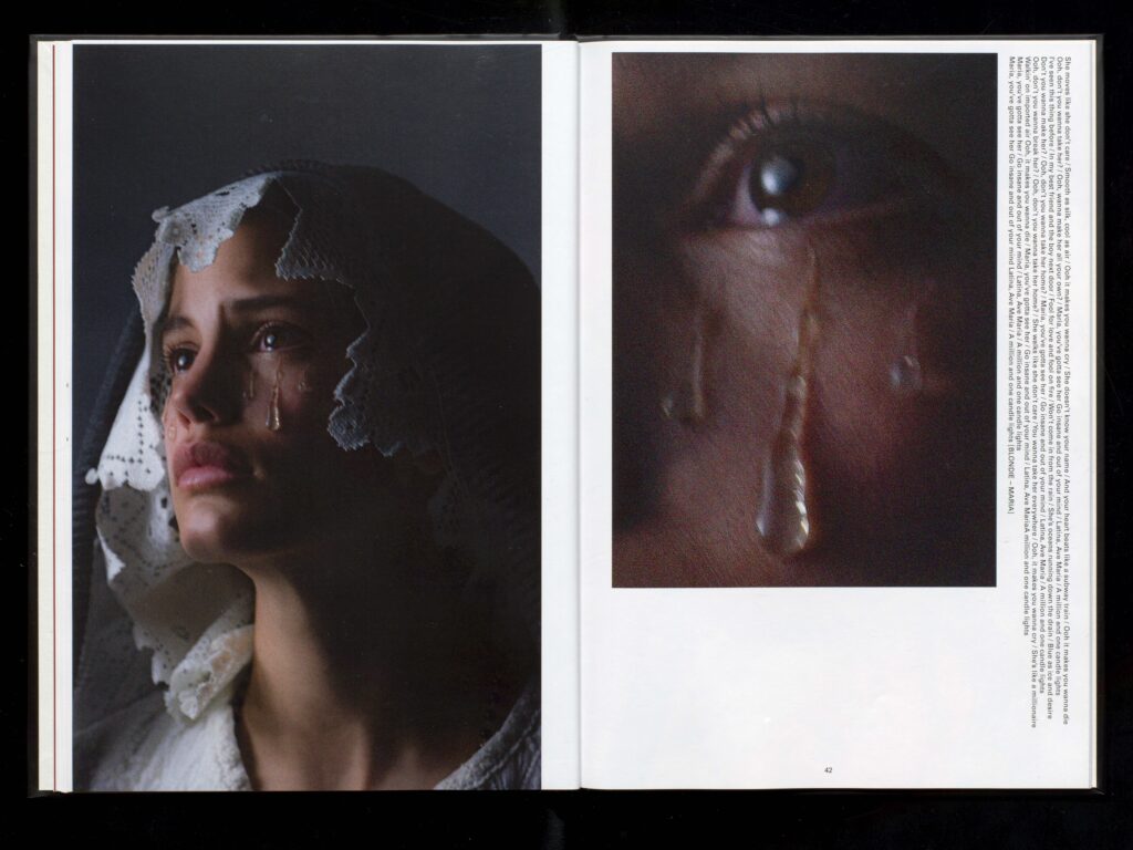
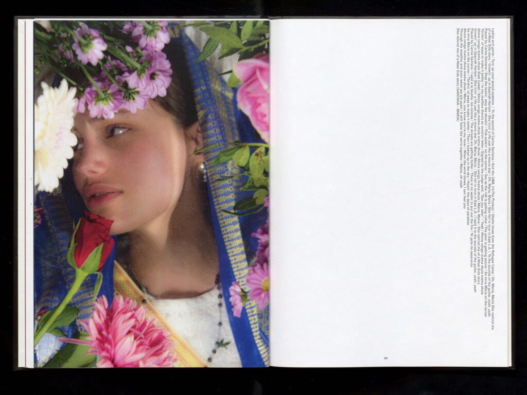
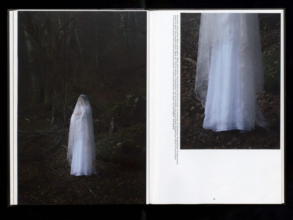
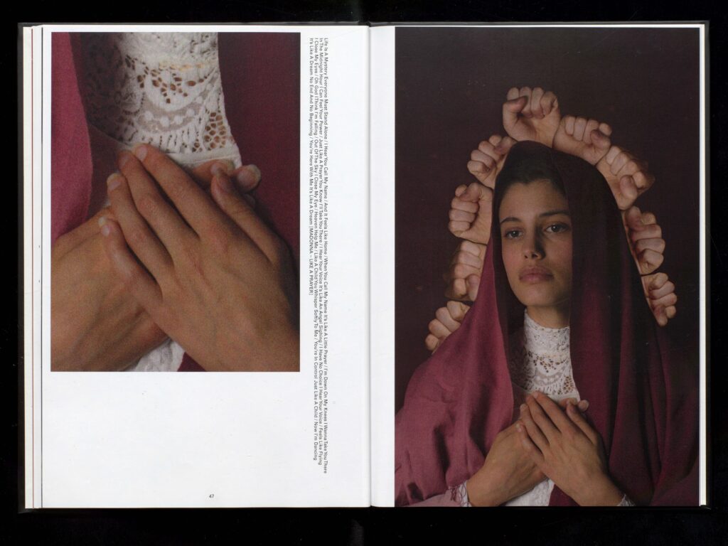
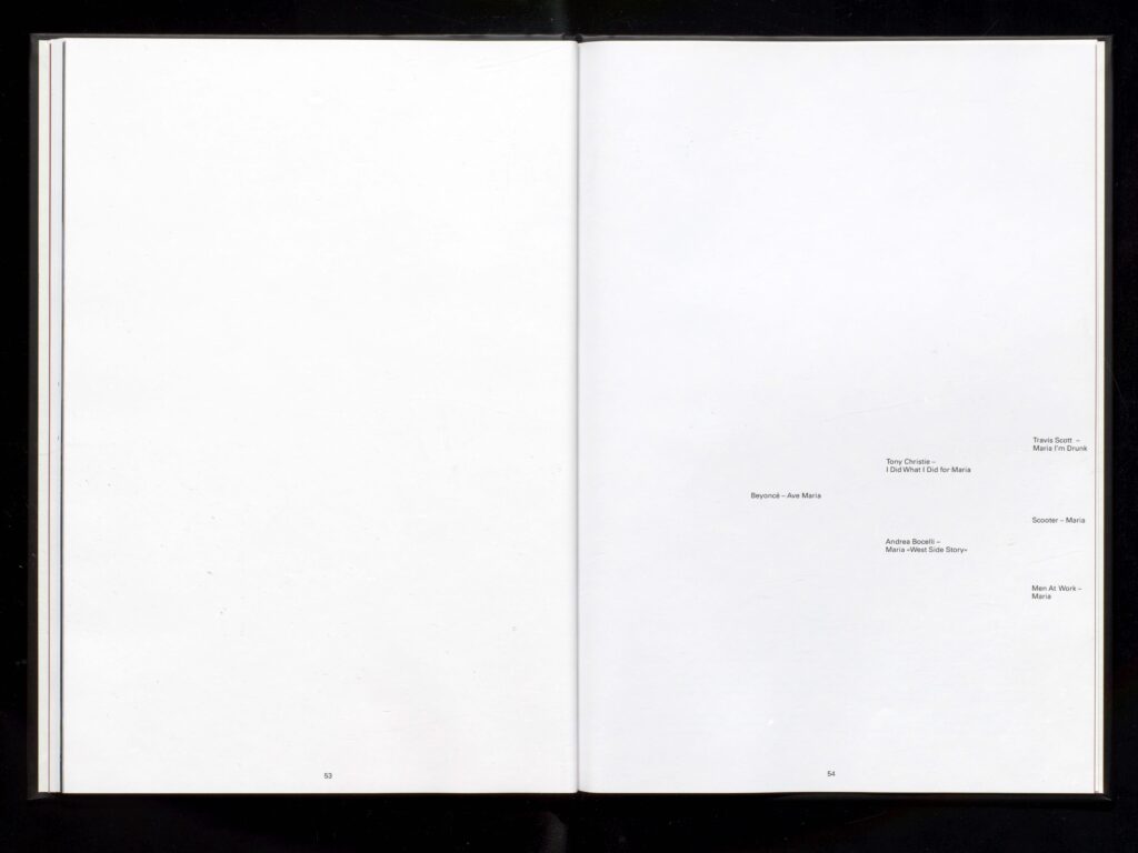
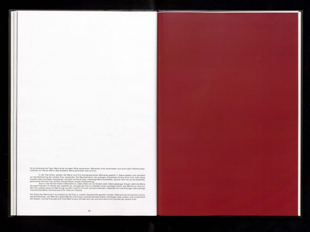
All The Girls Are Called Maria is a project that focuses on the question if the mythical persona Maria is a symbol of empowerment or suppression for the women on this earth. Both opinions were analyzed and compared. In addition I reproduced famous images of the christian church that hold place in the Bible.
Photography: Nicolai Jaron Kager
Text: Nicolai Jaron Kager
Model: Scarlett Victoria
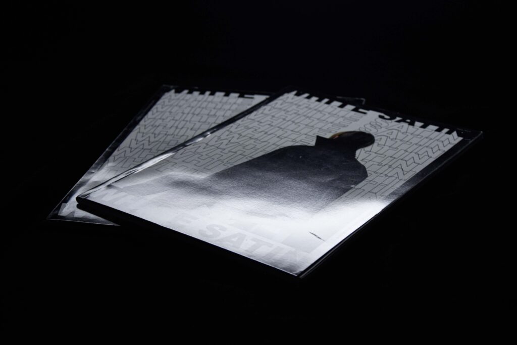
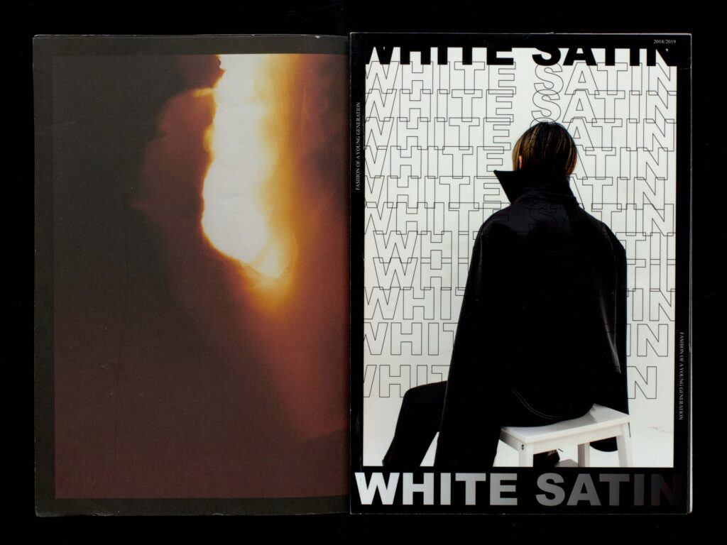
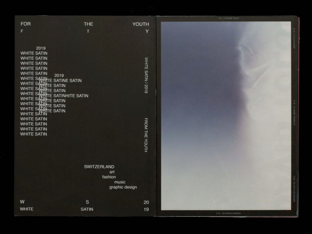
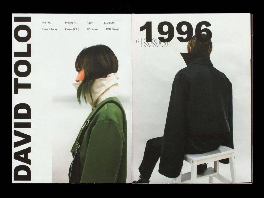
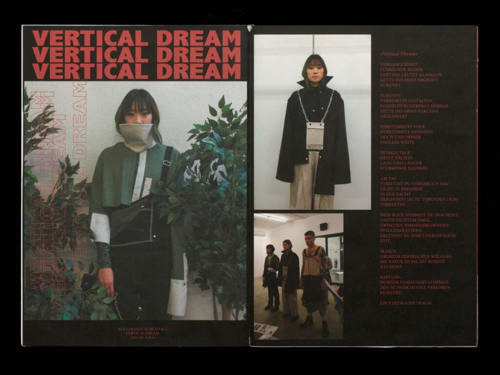
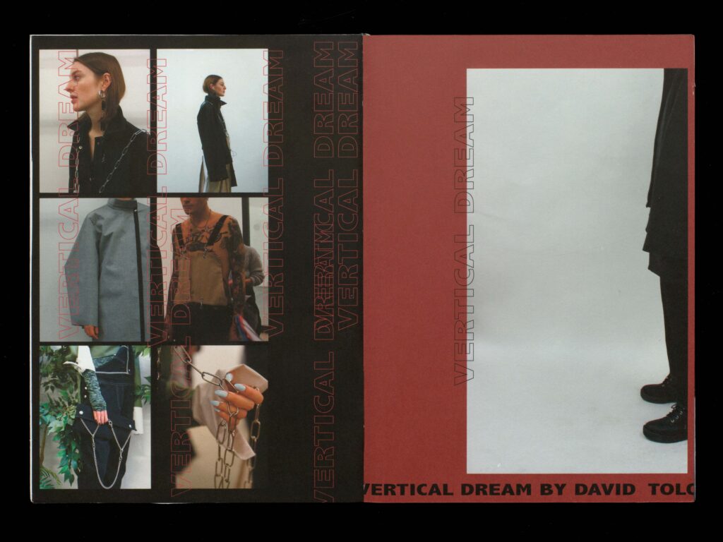
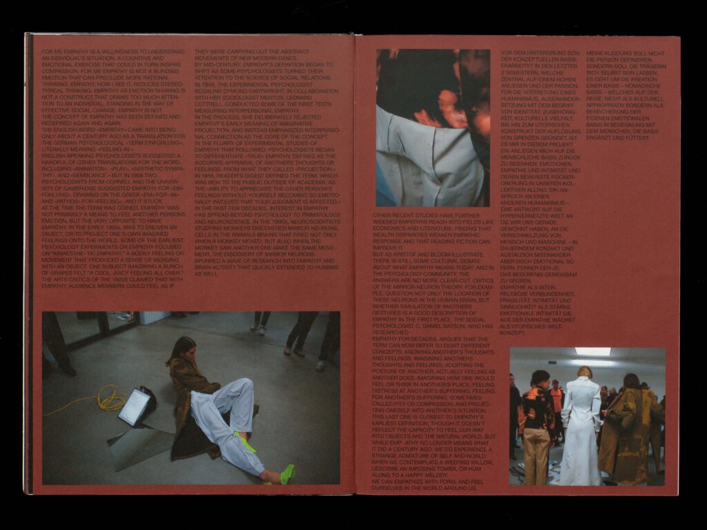
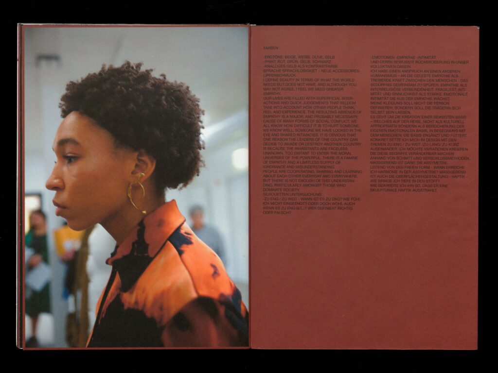
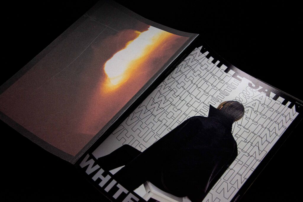
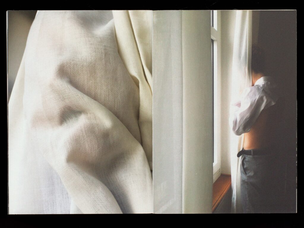
Swiss fashion design – A young generation wants to dress. White Satin is the prototype of a magazine that combines any form of creativity such as fashion, art, music and graphic design. The focus should be laying on the young generations. Starting in Switzerland, we have a large amount of young and unique artists. Further than that, this Magazine knows no boundaries and is able to adapt to every country, culture and human being on this planet. In this first edition several young fashion designers from switzerland will show their first steps in the world of fashion and showcase their newest collection or piece.
Photography: Nicolai Jaron Kager / HGK Basel
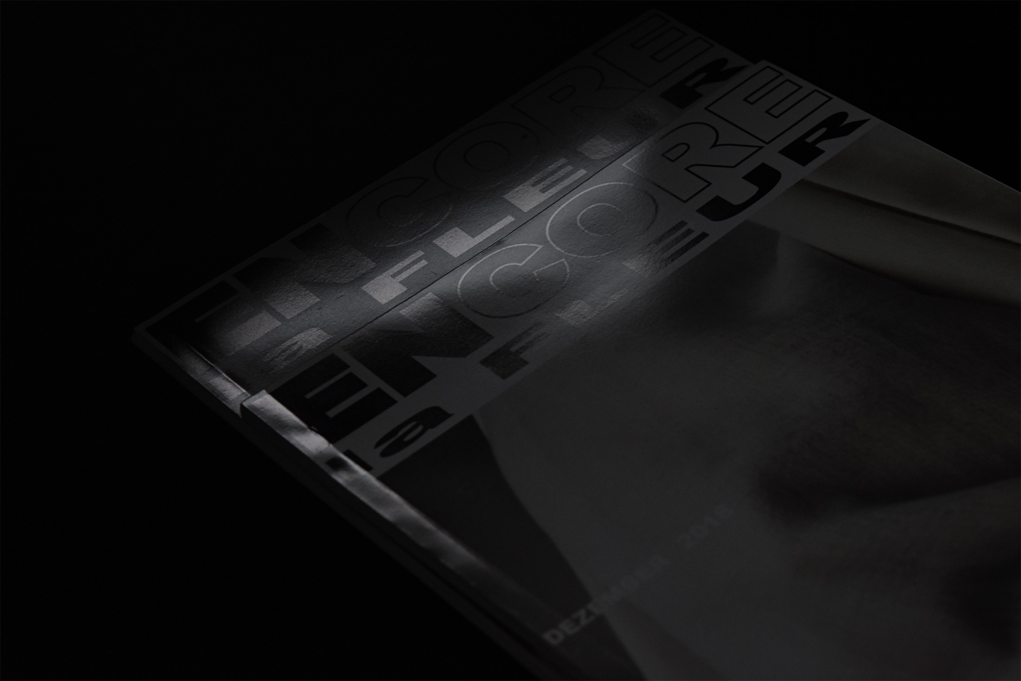
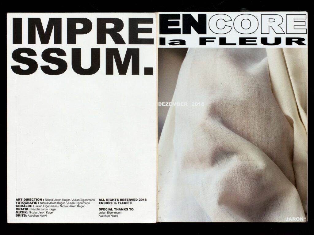
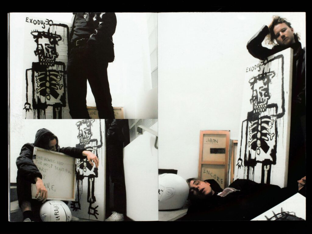
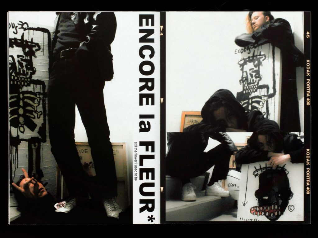
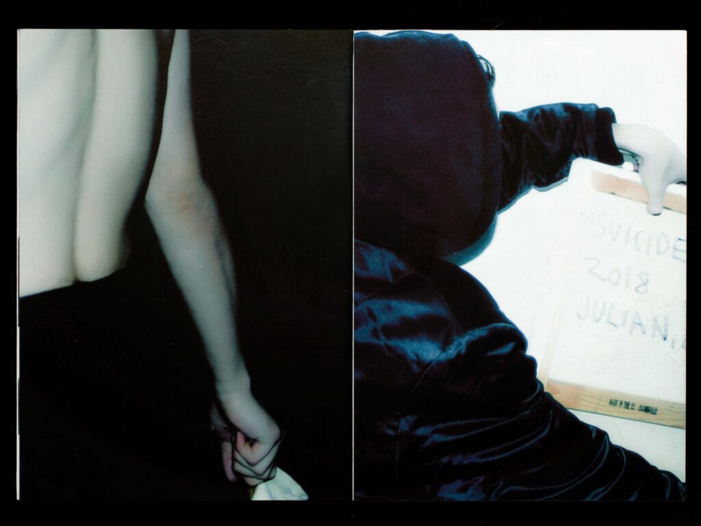
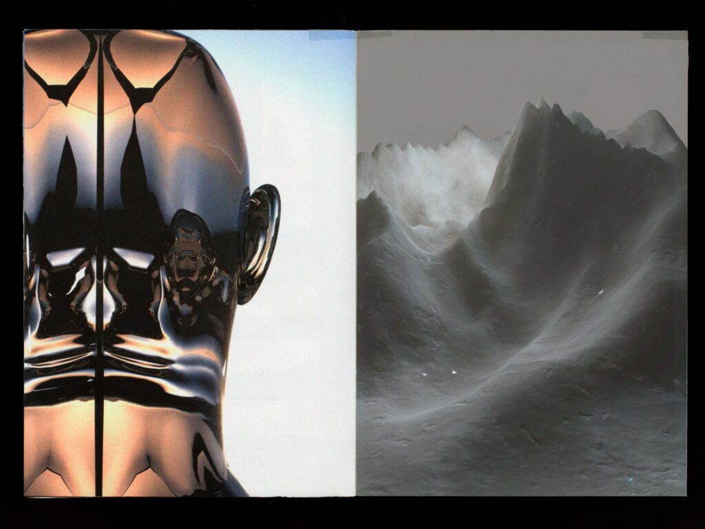
Sounds inspire images and images inspire sounds. For me, image and sound belong together. When I listen, whether it’s music or just individual sounds, I see colors and shapes. Whole worlds with their textures open up in front of me, scenarios surround me, I associate emotions with them. When I see pictures I feel a rhythm, melodies and sounds arise on their own, quite intuitively. I don’t know exactly where they come from. I wanted to investigate this phenomenon. During four weeks I tried to interpret my emotions and ideas and reproduce them with different media. In the process, as well as in the final product, sound and image complement each other.
Photography: Nicolai Jaron Kager / Julian Eigenmann
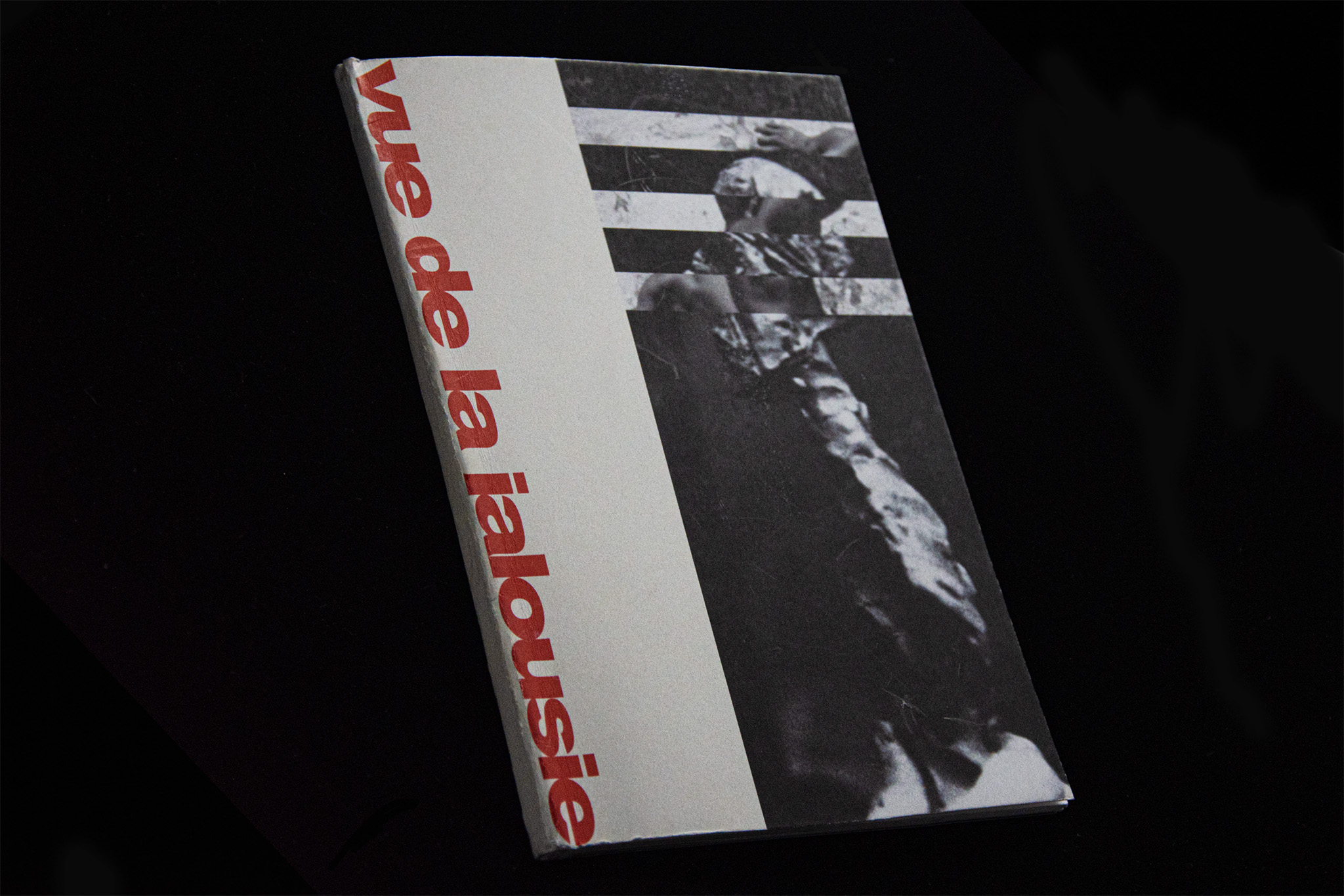
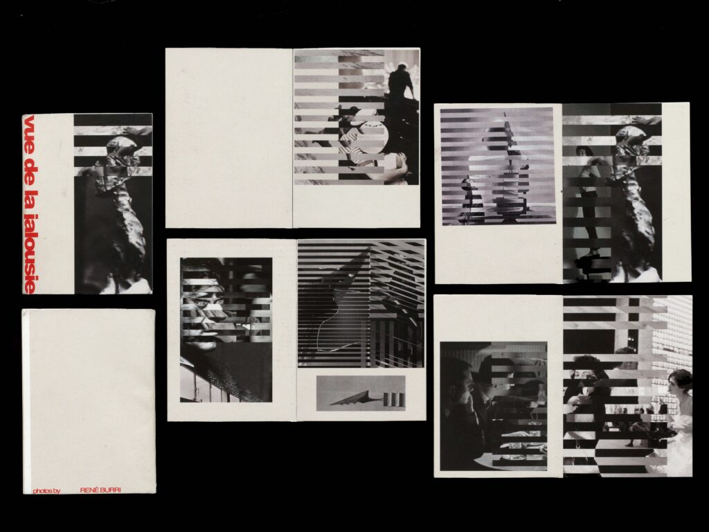
As part of the Viscom subject project on the topic of “paraphrase”, I dealt with Werner Jeker’s poster for René Burri’s exhibition “Photographs and Collages” at the Kunsthaus Zürich. Without imitating Jeker’s stripe technique, I made the blinds technique my own and tried to imprint my personal signature on it. The word “jalousie” is known from the French, as well as from the German. An arrangement of fixed and movable slats for privacy and sun protection. At the same time, the word “jalousie” in French means as much as jealousy.
Photography: René Burri
